WPFアプリで使うパネルの種類
- WPFアプリはパネルを使ってレイアウトを作ります
- どんなパネル系コントロールでどんなレイアウトができるかをご紹介
目次

・スクールは200,000円など高額、Freeksはサブスク型で10,780円から受講可能
・合うか不安でも、Freeksなら入会金0円、いつでも退会可能だから気軽に始められる
・途中で学ぶ言語を変更してもOK、追加料金なし
・24時間いつでも質問が可能、現役エンジニアが回答
・学習のみならず、転職支援もサポートあり、転職成功率は94.8%
WPFアプリで使うパネルの種類
WPFアプリは、画面サイズに合わせてレイアウトが動的に変わるフレキシブルレイアウトに強いメリットがあります。
フレキシブルレイアウトを実現するためにポイントになるのが、パネル系のコントロールです。
パネル系コントロールには、Grid、WrapPanel、StackPanel、DockPanel、Canvasがあります。
| パネル系コントロール | 内容 |
|---|---|
| Grid | 表形式に画面を分割 |
| WrapPanel | 左(上)に詰めて配置、画面サイズをはみ出す分は折り返す |
| StackPanel | 上(左)に詰めて配置、画面に収まる分までを表示 |
| DockPanel | 上下左右の指定した場所に詰めて配置 |
| Canvas | 固定位置に配置 |
このページでは、これらのコントロールの使い方を紹介します。
次のサンプルコードを使用します。
using System;
using System.Windows;

namespace SampleProgram
{
    class Program
    {
        [STAThread]
        static void Main(string[] args)
        {
            try
            {
                var app = new Application();
                app.Run(new MainWindow().getWindow());
            }
            catch (Exception ex)
            {
                MessageBox.Show(String.Format("正常な処理をすることができませんでした。\r\n{0}\r\n{1}", ex.Message, ex.StackTrace));
                return;
            }
        }
    }
}
namespace SampleProgram
{
    public class MainWindow
    {
        private System.Windows.Window _window;

        // コンストラクタ
        public MainWindow()
        {
            // XAMLファイルを読み込んでフォーム生成
            string path = System.AppDomain.CurrentDomain.BaseDirectory;
            using (var fs = new System.IO.FileStream(path+"MainWindow.xaml",
                System.IO.FileMode.Open, System.IO.FileAccess.Read))
            {
                _window = (System.Windows.Window)System.Windows.Markup.XamlReader.Load(fs);
            }
        }

        // Windowクラスを返す
        public System.Windows.Window getWindow()
        {
            return _window;
        }
    }
}
<Window xmlns="http://schemas.microsoft.com/winfx/2006/xaml/presentation"
	xmlns:x="http://schemas.microsoft.com/winfx/2006/xaml"
	Title="SampleProgram"
	Width="500"
	Height="300"
	WindowStartupLocation="CenterScreen"
	FontSize="13"
	FontFamily="メイリオ">

</Window>
C:\Windows\Microsoft.NET\Framework\v4.0.30319\csc.exe ^
  /t:winexe ^
  /r:"WPF\PresentationCore.dll" ^
  /r:"WPF\PresentationFramework.dll" ^
  /r:"WPF\WindowsBase.dll" ^
  /r:"System.Xaml.dll" ^
  /out:SampleProgram.exe ^
  *.cs
pause
ファイルを作成できたらCompile.batを実行してみましょう。
同じフォルダにSampleProgram.exeが作成されます。
SampleProgram.exeを実行して白いだけのウィンドウが表示されれば成功です。
MainWindow.xamlファイルのみを書き換えながら、各パネルの使い方を紹介していきます。
各コントールごとの使い方
Grid、WrapPanel、StackPanel、DockPanel、Canvas、それぞれの使い方を紹介してきます。
MainWindow.xamlファイル以外は、WPFアプリで使うパネルの種類で紹介したソースをそのまま使用します。
Grid
Gridは、画面を表形式に分割して、その中にコントロールを配置します。
<Window xmlns="http://schemas.microsoft.com/winfx/2006/xaml/presentation"
	xmlns:x="http://schemas.microsoft.com/winfx/2006/xaml"
	Title="SampleProgram"
	Width="500"
	Height="300"
	WindowStartupLocation="CenterScreen"
	FontSize="13"
	FontFamily="メイリオ">

	<Grid>

		<Grid.RowDefinitions>
		  <RowDefinition Height="3*" />
		  <RowDefinition Height="1*" />
		  <RowDefinition Height="1*" />
		</Grid.RowDefinitions>

		<Grid.ColumnDefinitions>
		  <ColumnDefinition Width="150" />
		  <ColumnDefinition Width="150" />
		  <ColumnDefinition Width="150" />
		</Grid.ColumnDefinitions>

        <Button
        	Content="Button1"
        	Grid.Row="0"
        	Grid.Column="0" />

        <Button
        	Content="Button2"
        	Grid.Row="1"
        	Grid.Column="0" />

        <Button
        	Content="Button3"
        	Grid.Row="0"
        	Grid.Column="1" />

        <Button
        	Content="Button4"
        	Grid.Row="1"
        	Grid.Column="1" />

        <Button
        	Content="Button5"
        	Grid.Row="2"
        	Grid.Column="0"
        	Grid.ColumnSpan="2" />

        <Button
        	Content="Button6"
        	Grid.Row="0"
        	Grid.Column="2"
        	Grid.RowSpan="3" />

	</Grid>
</Window>
MainWindow.xamlファイルを上記のように書き換えて、SampleProgram.exeを実行してください。
次の画面を表示します。

解説していきます。
		<Grid.RowDefinitions>
		  <RowDefinition Height="3*" />
		  <RowDefinition Height="1*" />
		  <RowDefinition Height="1*" />
		</Grid.RowDefinitions>
Gridタグの中にGrid.RowDefinitionsを定義することで、Gridの行単位の高さを指定します。
RowDefinitionの個数分、行が分割されます。
Heightの指定は、次の2つ方法があります。
1.数字のみで固定幅を指定する方法
2.*を使って割合指定する方法(*の前に比率を指定)
この例では1行目を3*、2行目と3行目を1*で指定しています。
1行目、2行目、3行目を3:1:1の高さにするという意味になります。
画面の高さを変更しても、3:1:1の高さになるように自動調整されます。
		<Grid.ColumnDefinitions>
		  <ColumnDefinition Width="150" />
		  <ColumnDefinition Width="150" />
		  <ColumnDefinition Width="150" />
		</Grid.ColumnDefinitions>
Gridタグの中にGrid.ColumnDefinitionsを定義することで、Gridの列単位の幅を指定します。
RowDefinitionと同じようにColumnDefinitionの個数分、列が分割されます。
列に対してはWidthで幅を指定します。
RowDefinitionのHeightと同じように固定幅を指定する方法と、*を使って割合指定する方法が使えます。
この例では150で固定幅にしています。
        <Button
        	Content="Button1"
        	Grid.Row="0"
        	Grid.Column="0" />
Gridタグの中に他のコントロールを記載することで、Grid内にコントロールを配置できます。
Grid.RowとGrid.Columnを使って、Grid内のどの位置に配置するかを指定します。
Grid.Rowは何行目かを、Columnで何列目かを指定します。
0始まりで指定します。
WrapPanel
WrapPanelは、コントロールを横向きに順番に並べます。
幅を超過した分は、折り返して次の行として並べます。
Orientation="Vertical"を指定することで、縦方向にも並べることができます。
<Window xmlns="http://schemas.microsoft.com/winfx/2006/xaml/presentation"
	xmlns:x="http://schemas.microsoft.com/winfx/2006/xaml"
	Title="SampleProgram"
	Width="500"
	Height="300"
	WindowStartupLocation="CenterScreen"
	FontSize="13"
	FontFamily="メイリオ">

	<WrapPanel>
        <Button Content="Button1" Margin="5"/>
        <Button Content="Button2" Margin="5" />
        <Button Content="Button3" Margin="5" />
        <Button Content="Button4" Margin="5" />
        <Button Content="Button5" Margin="5" />
        <Button Content="Button6" Margin="5" />
        <Button Content="Button7" Margin="5" />
        <Button Content="Button8" Margin="5" />
        <Button Content="Button9" Margin="5" />
        <Button Content="Button10" Margin="5" />
	</WrapPanel>
</Window>
MainWindow.xamlファイルを上記のように書き換えて、SampleProgram.exeを実行してください。
次の画面を表示します。

Button7までは横並びに等間隔で表示しています。
Button8からは横に表示しきれなくなったので、2段目に横並びに表示しています。
このサンプルではMarginを指定して、各コントロールの周りにスペースを作っています。
Marginの指定をなくすと、ボタンがぴったり隙間なく横並びになります。
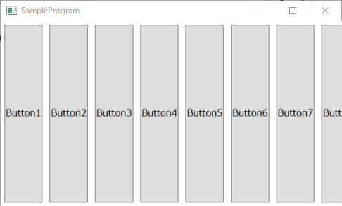
StackPanel
StackPanelは、コントロールを縦向きに隙間なく並べます。
高さを超過した分は非表示になります。
画面の高さを変えると隠れていた分も表示されます。
Orientation="Horizontal"を指定することで、横方向に並べることもできます。
<Window xmlns="http://schemas.microsoft.com/winfx/2006/xaml/presentation"
	xmlns:x="http://schemas.microsoft.com/winfx/2006/xaml"
	Title="SampleProgram"
	Width="500"
	Height="300"
	WindowStartupLocation="CenterScreen"
	FontSize="13"
	FontFamily="メイリオ">

	<StackPanel>
        <Button Content="Button1" Margin="5"/>
        <Button Content="Button2" Margin="5" />
        <Button Content="Button3" Margin="5" />
        <Button Content="Button4" Margin="5" />
        <Button Content="Button5" Margin="5" />
        <Button Content="Button6" Margin="5" />
        <Button Content="Button7" Margin="5" />
        <Button Content="Button8" Margin="5" />
        <Button Content="Button9" Margin="5" />
        <Button Content="Button10" Margin="5" />
	</StackPanel>
</Window>
MainWindow.xamlファイルを上記のように書き換えて、SampleProgram.exeを実行してください。
次の画面を表示します。

WrapPanelと違って特に幅指定等なければ、上詰めで画面に合わせた幅になります。
Button8までは表示されていますが、Button8の下部以降の画面からはみ出る部分が非表示になります。
このサンプルではMarginを指定して、各コントロールの周りにスペースを作っています。
Marginの指定をなくすと、ボタンが縦にぴったり隙間なく並びます。
DockPanel
DockPanelは、コントロールを上下左右のどこかに寄せて配置します。
<Window xmlns="http://schemas.microsoft.com/winfx/2006/xaml/presentation"
	xmlns:x="http://schemas.microsoft.com/winfx/2006/xaml"
	Title="SampleProgram"
	Width="500"
	Height="300"
	WindowStartupLocation="CenterScreen"
	FontSize="13"
	FontFamily="メイリオ">

	<DockPanel LastChildFill="True">

        <Button
        	Content="Top"
        	DockPanel.Dock="Top"
        	Background="Red" />

        <Button
        	Content="Right"
        	DockPanel.Dock="Right"
        	Background="Blue" />

        <Button
        	Content="Bottom"
        	DockPanel.Dock="Bottom"
        	Background="Green" />

        <Button
        	Content="Left"
        	DockPanel.Dock="Left"
        	Background="Yellow" />

        <Button
        	Content="Top"
        	DockPanel.Dock="Top"
        	Background="Ivory" />

        <Button
        	Content="LastChildFill"
        	Background="Pink" />

	</DockPanel>
</Window>
MainWindow.xamlファイルを上記のように書き換えて、SampleProgram.exeを実行してください。
次の画面を表示します。
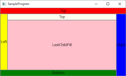
サンプルでは、コントロールの境がわかりやすくなるようにBackgroundで背景色を指定しています。
各コントロールにDockPanel.Dock属性で表示位置を指定します。
| DockPanel.Dock | 内容 |
|---|---|
| Top | 上寄せ |
| Bottom | 下寄せ |
| Left | 左寄せ |
| Right | 右寄せ |
同じDockPanel.Dockが指定されたり、寄せたコントロールが重なる場合は、後に記載しているコントールの方が内側に配置されます。
DockPanelの属性として、LastChildFill="True"を指定すると、最後のコントロールが余白を埋める形で配置されます。
Canvas
Canvasは、コントロールを位置を指定して位置固定で配置する場合に使用します。
フレキシブルレイアウトにならないので、あまり使用しません。
<Window xmlns="http://schemas.microsoft.com/winfx/2006/xaml/presentation"
	xmlns:x="http://schemas.microsoft.com/winfx/2006/xaml"
	Title="SampleProgram"
	Width="500"
	Height="300"
	WindowStartupLocation="CenterScreen"
	FontSize="13"
	FontFamily="メイリオ">

	<Canvas>

        <Button
        	Content="Button1"
        	Canvas.Top="10"
        	Canvas.Left="10" />

        <Button
        	Content="Button2"
        	Canvas.Top="130"
        	Canvas.Left="50" />

        <Button
        	Content="Button3"
        	Canvas.Top="50"
        	Canvas.Left="180" />

        <Button
        	Content="Button4"
        	Canvas.Top="200"
        	Canvas.Left="200" />

	</Canvas>
</Window>
MainWindow.xamlファイルを上記のように書き換えて、SampleProgram.exeを実行してください。
次の画面を表示します。
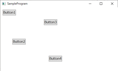
各コントロールにCanvas.Top、Canvas.Left属性で表示位置を指定します。
Canvas.Topが上からの位置、Canvas.Leftが左からの位置です。
縦横を入替えた表示
WrapPanelとStackPanelは縦横を入れ替えて使用することもできます。
縦横の方向指定は、Orientation="Vertical"で縦方向、Orientation="Horizontal"で横方向になります。
WrapPanel
WrapPanelは、Orientation="Vertical"を指定することで、縦向きに並べることができます。
高さを超過した分は、折り返して次の列として並べます。
<Window xmlns="http://schemas.microsoft.com/winfx/2006/xaml/presentation"
	xmlns:x="http://schemas.microsoft.com/winfx/2006/xaml"
	Title="SampleProgram"
	Width="500"
	Height="300"
	WindowStartupLocation="CenterScreen"
	FontSize="13"
	FontFamily="メイリオ">

	<WrapPanel Orientation="Vertical">
        <Button Content="Button1" Margin="5"/>
        <Button Content="Button2" Margin="5" />
        <Button Content="Button3" Margin="5" />
        <Button Content="Button4" Margin="5" />
        <Button Content="Button5" Margin="5" />
        <Button Content="Button6" Margin="5" />
        <Button Content="Button7" Margin="5" />
        <Button Content="Button8" Margin="5" />
        <Button Content="Button9" Margin="5" />
        <Button Content="Button10" Margin="5" />
	</WrapPanel>
</Window>
MainWindow.xamlファイルを上記のように書き換えて、SampleProgram.exeを実行してください。
次の画面を表示します。
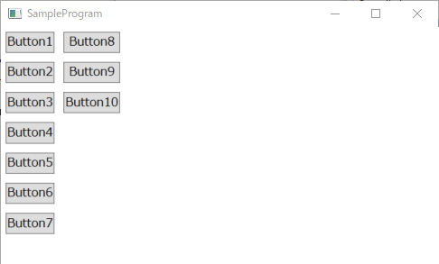
StackPanel
WrapPanelは、Orientation="Horizontal"を指定することで、横向きに並べることができます。
幅を超過した分は表示されません。
<Window xmlns="http://schemas.microsoft.com/winfx/2006/xaml/presentation"
	xmlns:x="http://schemas.microsoft.com/winfx/2006/xaml"
	Title="SampleProgram"
	Width="500"
	Height="300"
	WindowStartupLocation="CenterScreen"
	FontSize="13"
	FontFamily="メイリオ">

	<StackPanel Orientation="Horizontal">
        <Button Content="Button1" Margin="5"/>
        <Button Content="Button2" Margin="5" />
        <Button Content="Button3" Margin="5" />
        <Button Content="Button4" Margin="5" />
        <Button Content="Button5" Margin="5" />
        <Button Content="Button6" Margin="5" />
        <Button Content="Button7" Margin="5" />
        <Button Content="Button8" Margin="5" />
        <Button Content="Button9" Margin="5" />
        <Button Content="Button10" Margin="5" />
	</StackPanel>
</Window>
MainWindow.xamlファイルを上記のように書き換えて、SampleProgram.exeを実行してください。
次の画面を表示します。